Ecommerce CRO case study · Luxury jewelry
A beautiful store that whispered when it should have spoken
Marco Dal Maso looked premium but the product pages converted at around 1.5% with a 73% bounce. We rebuilt the buying journey CRO-first, around purchase confidence and friction, not design polish.
Start with the $2,000 CRO Audit
Results at a glance
What the redesign moved
1.5%
Before · add-to-cart
2.4%
After · add-to-cart
+28%
PDP conversion
+63%
Mobile add-to-cart
-41%
PDP bounce
-2
Typefaces
The client
Meet Marco Dal Maso
An Italian luxury jewelry brand known for handcrafted sterling silver, premium materials, and distinctive craftsmanship, with a strong visual identity and excellent product photography.
Industry
Luxury Jewelry
Platform
Shopify
Location
Italy
Focus
PDP · Cart · Mobile
The business challenge
Not a traffic problem, a decision problem.
Internal analysis revealed several opportunities across the buying journey. The challenge wasn't traffic, it was converting product interest into purchase intent. A 1.5% PDP add-to-cart rate and a 73% PDP bounce meant high-traffic products drew attention but generated limited purchases.
Audit snapshot
Key findings
- Features prioritized over decision-making
- Trust signals lacked visibility
- Variant and size selection created friction
- Product discovery underutilized
- Cart worked as storage, not conversion
- Weak luxury product storytelling
- Mobile shoppers hitting friction
- Cross-sell opportunities underused
CRO hypotheses
Five working hypotheses
Reducing decision friction around sizing and variant selection would create a smoother path to purchase.
Bringing trust-building content closer to the Add-to-Cart section would increase customer confidence.
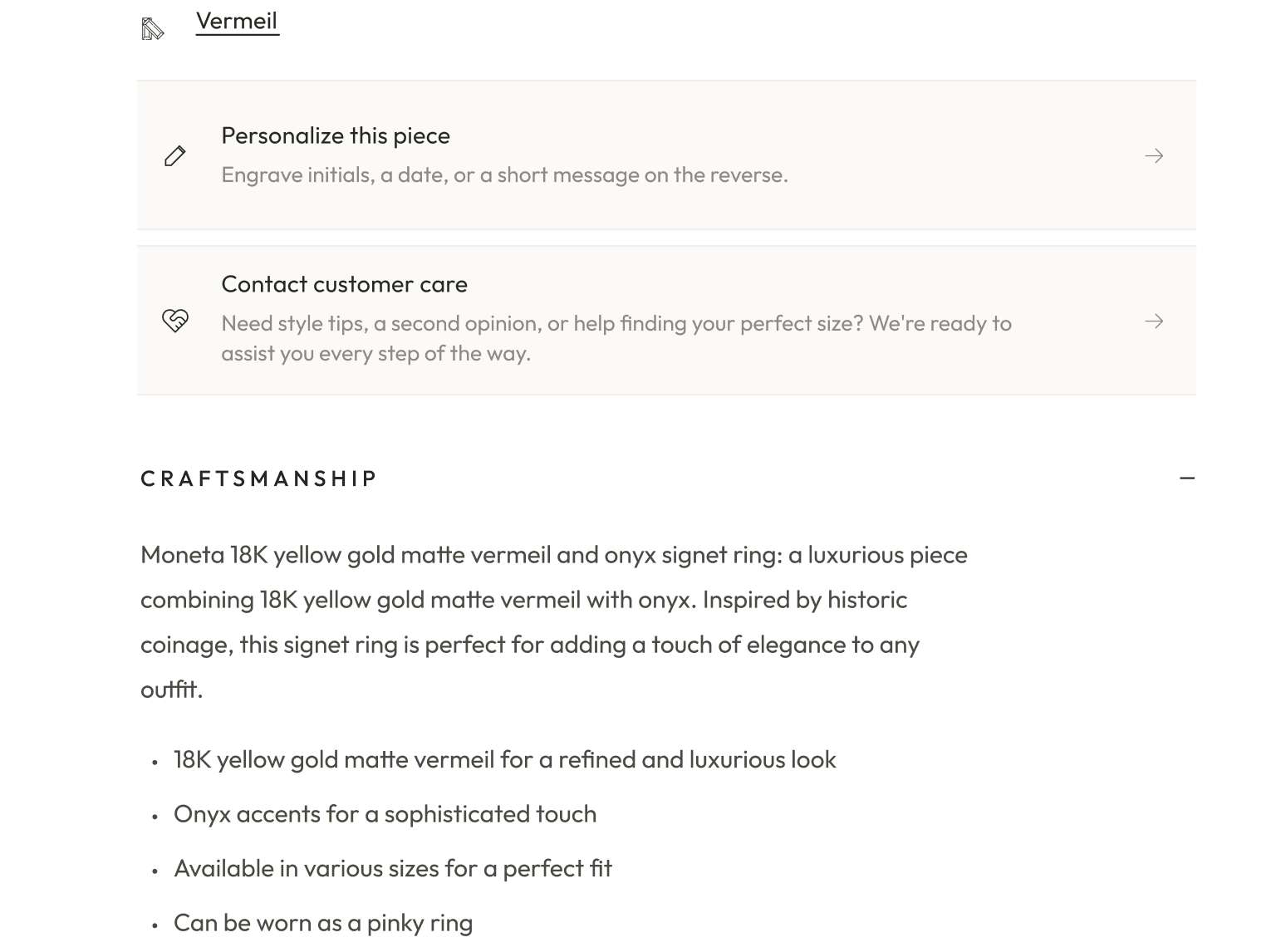
Improved product storytelling would strengthen engagement and reduce abandonment.
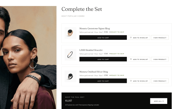
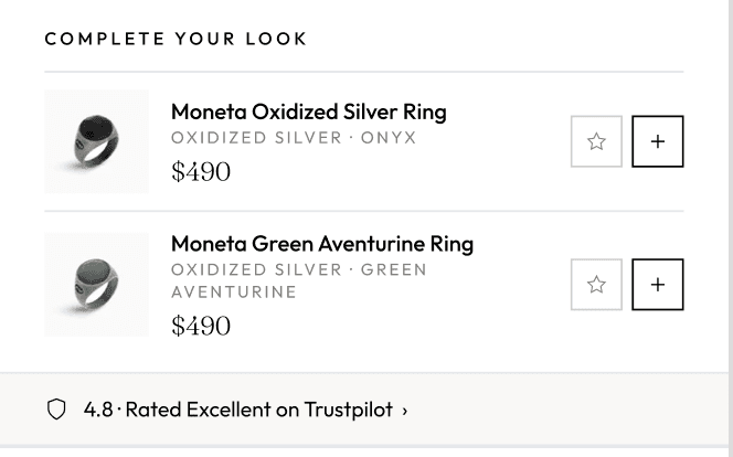
Better product recommendations would encourage larger baskets and stronger product discovery.
A conversion-focused cart experience would maintain purchase momentum and support checkout progression.
The strategy
Redesigned for decision-making, not aesthetics.
Every component was rebuilt around three principles: increase purchase confidence, reduce decision friction, and increase product discovery.
The redesign, screen by screen
Before
After
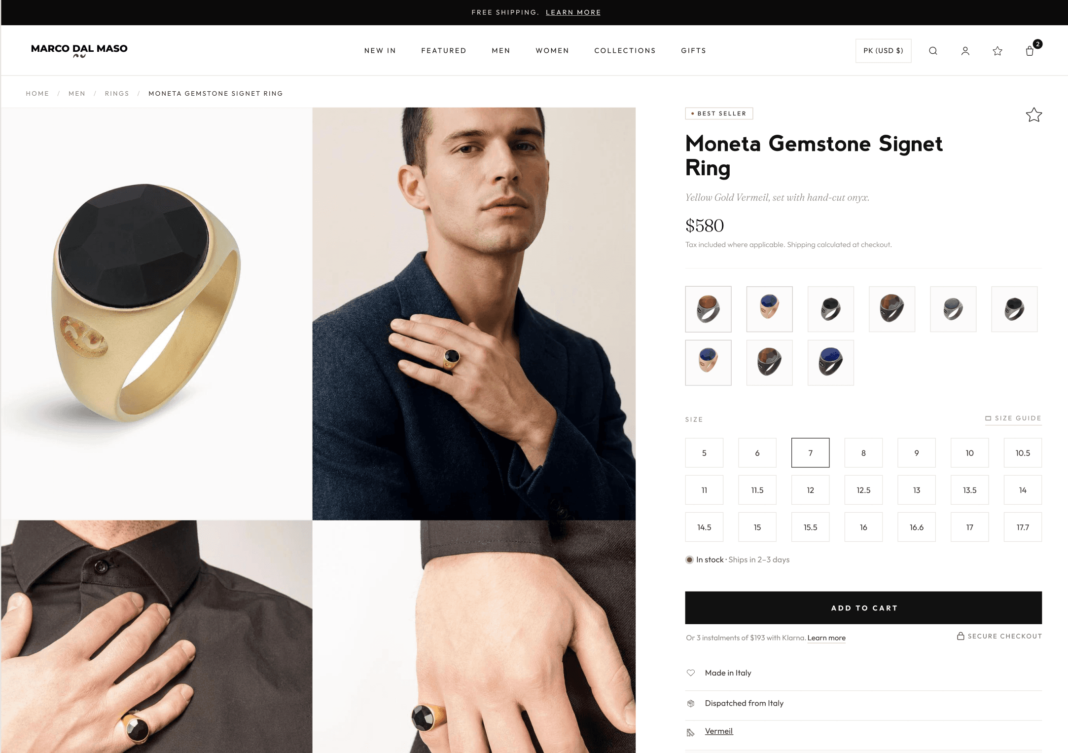
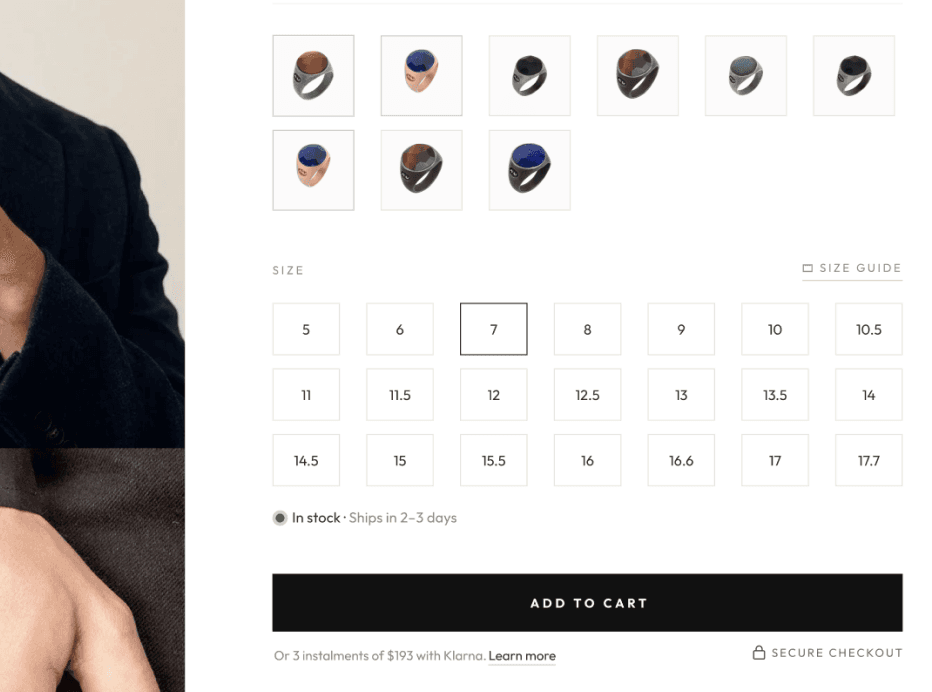
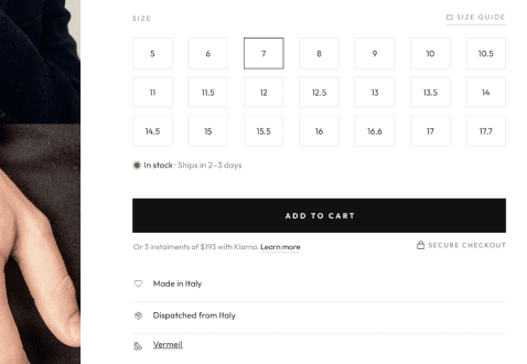
Product page
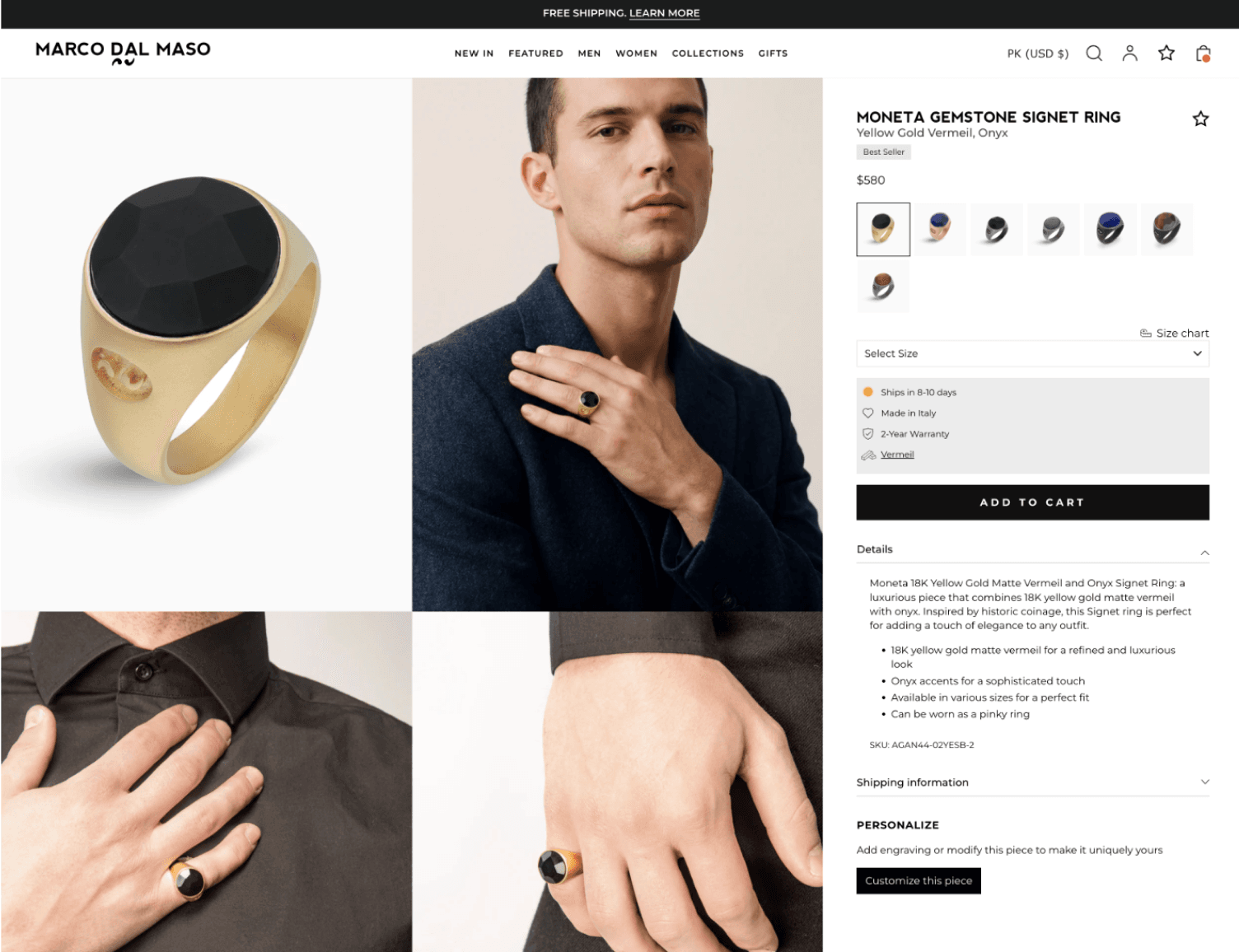
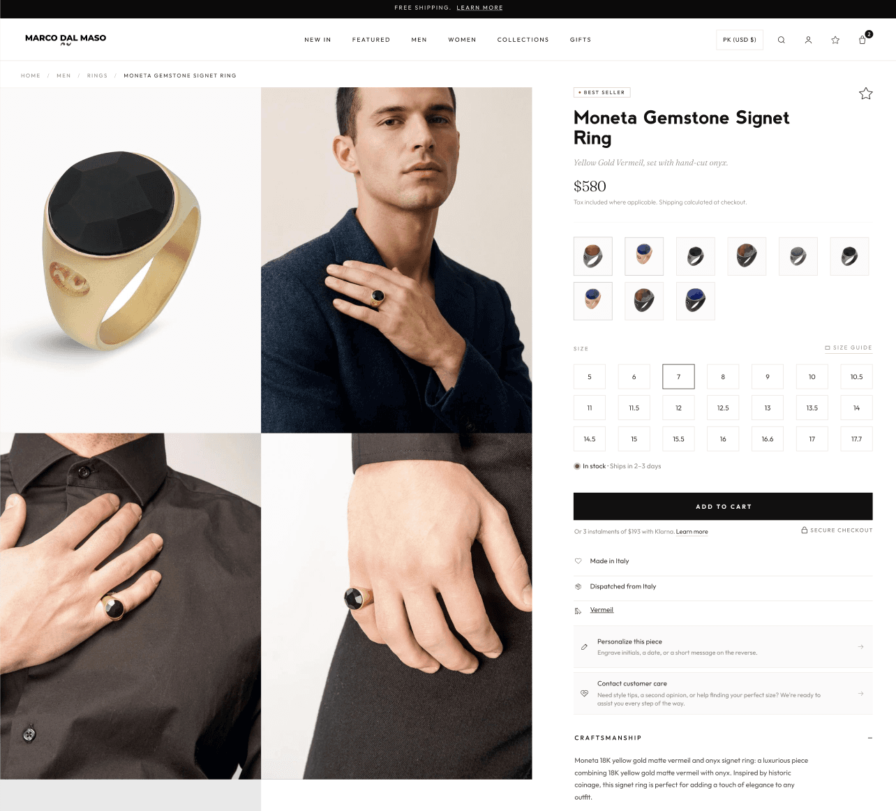
Before
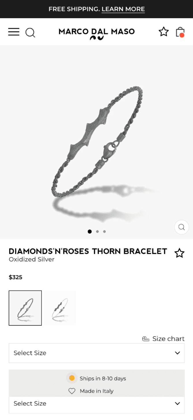
After
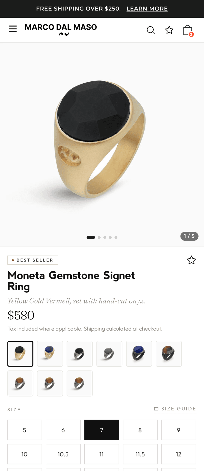
Product page
Before
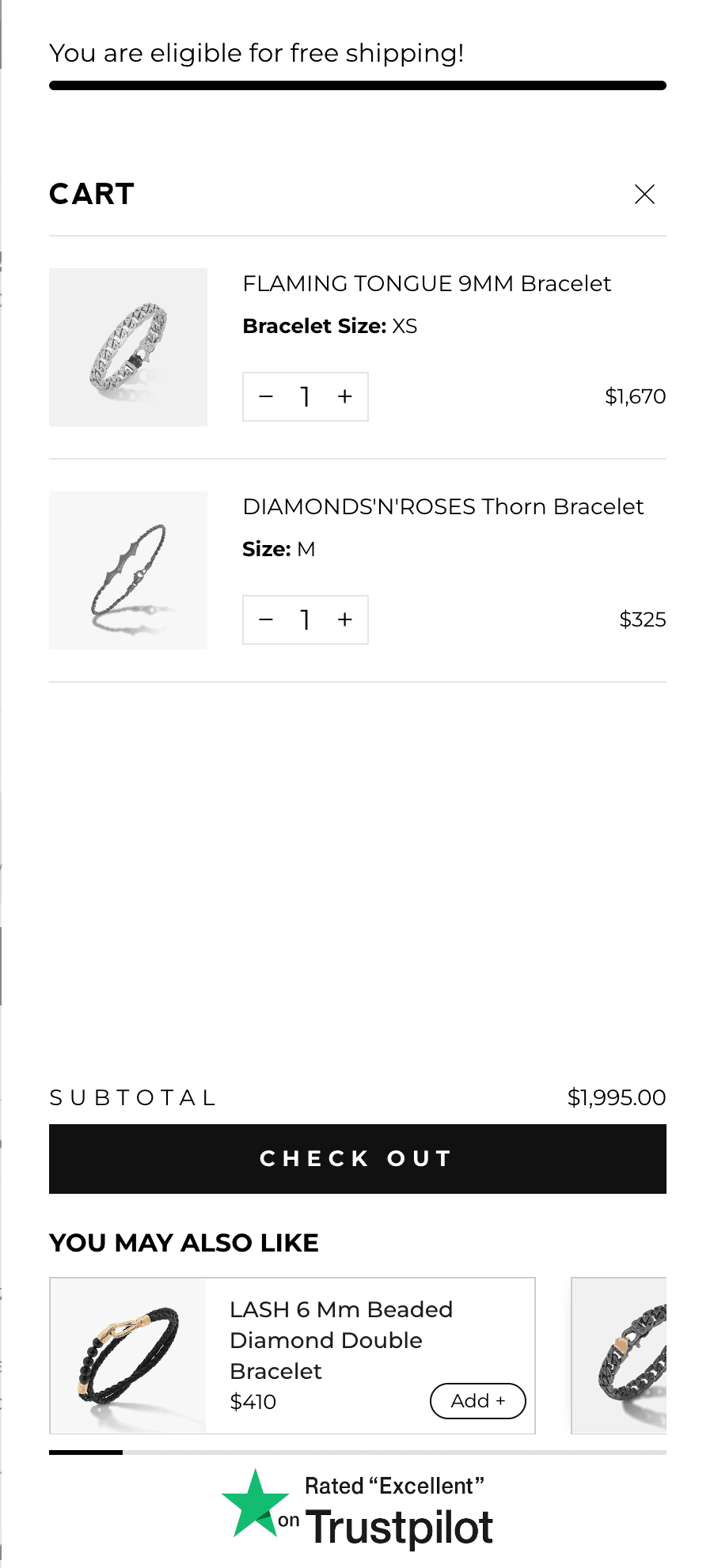
After
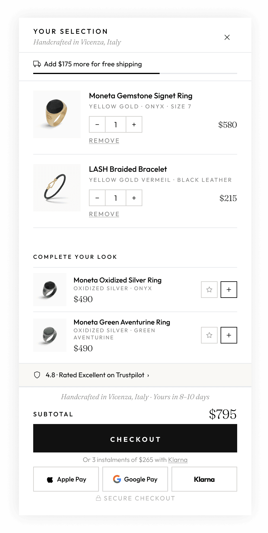
Cart drawer
Key conversion improvements
Final takeaway
In the client's words

“Thank you for all your efforts. We got there!”
Natasha Faith
Business Development & Operations, Marco Dal Maso
FAQ
What this project shows
The store already looked premium. The problem was beneath the surface: weak hierarchy, hidden trust signals, and friction in sizing and cart. We redesigned for decision-making, so every change targeted purchase confidence and friction, not just aesthetics.
Your store could be next
Beautiful products that aren't converting?
If your store looks premium but the product pages do not convert, the gap is usually purchase confidence and friction, not design polish. Start with the $2,000 CRO audit and we will find it.
Book your CRO Audit, $2,000Explore the Growth Retainer